
User experience (UX) in gym websites is defined as how easily and effectively visitors find information, engage with services, and convert into paying members through a site's design and functionality. The role of user experience in gym websites goes far beyond aesthetics. A slow page, a buried pricing page, or a clunky booking form each cost you real members every day. With over 70% of gym website traffic arriving on mobile devices, the gap between a site that converts and one that frustrates is measured in seconds and clicks. This guide gives you the specific fixes that move the needle, backed by 2026 industry data and real case studies.
How does website speed and mobile responsiveness affect user engagement for gyms?
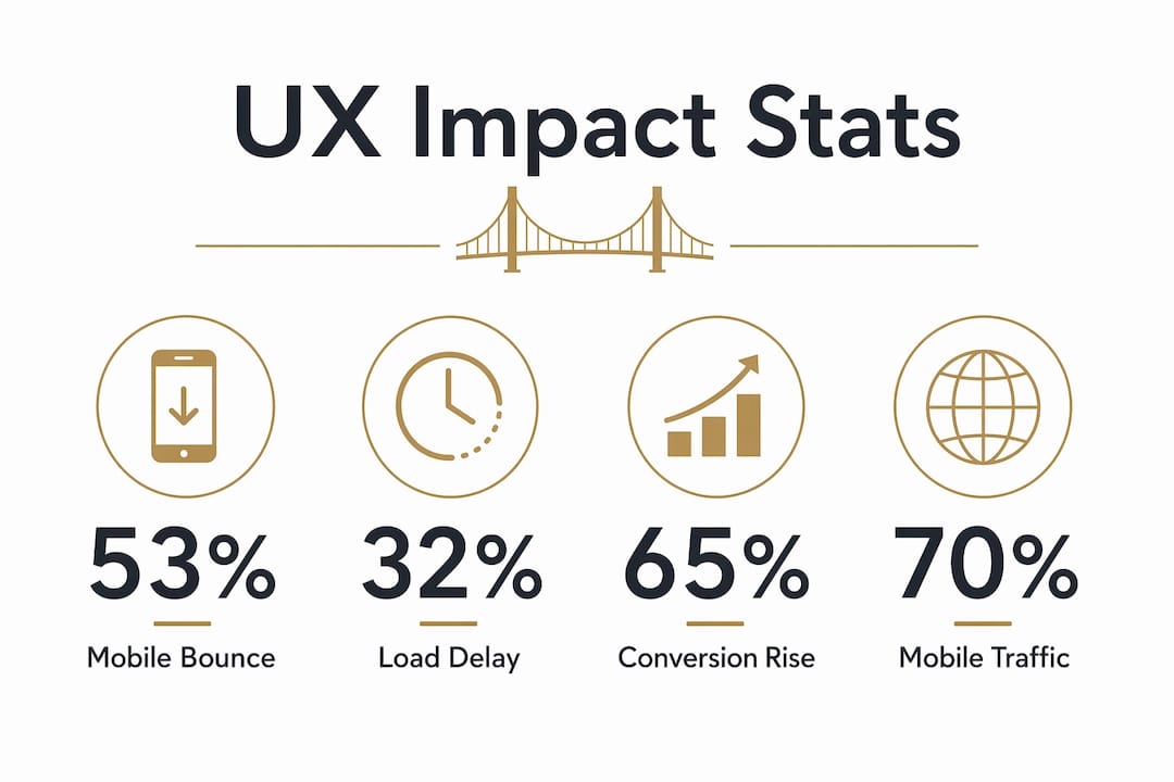
Site speed is the first UX test your gym website faces, and most sites fail it before a visitor reads a single word. 53% of mobile visitors abandon gym websites that take longer than 3 seconds to load. That means more than half your mobile traffic disappears before they see your offer.
The damage compounds quickly. Bounce rates rise 32% when load times increase from 1 to 3 seconds. A visitor who bounces never sees your class schedule, your pricing, or your free trial offer. Speed is not a technical detail. It is a direct revenue variable.
Mobile responsiveness is equally non-negotiable. Because 70%+ of gym website traffic comes from smartphones, a site designed only for desktop is effectively broken for most of your audience. Responsive design means your layout, text size, and buttons adapt automatically to any screen. A prospect browsing from their phone at 7:00 AM before work needs to find your class times and book a trial in under two minutes.
The fastest practical fixes are also the simplest. Replace large background videos with a static hero image. Compress every photo before uploading. Remove plugins that load external scripts on every page. Use Google PageSpeed Insights to score your site and identify the specific files slowing it down. A score above 90 on mobile is the standard worth targeting.

Pro Tip: Run your gym website through Google PageSpeed Insights on mobile mode, not desktop. Most gym owners only check the desktop score and miss the real problem.
What design best practices on gym websites build trust quickly?
Your homepage has approximately 4 seconds to answer one question for every new visitor: "Is this gym for me?" That window closes fast. The hero section at the top of your page must answer it with a one-line value proposition, a real photo of your facility or members, and a single primary call-to-action (CTA). "Join Now," "Book a Free Trial," or "See Membership Options" each work. Three competing CTAs do not.
Pricing transparency is one of the highest-leverage UX decisions you can make. Gyms that hide pricing lose 30–40% of qualified leads and waste staff time fielding calls from prospects who were never going to join. Showing your pricing page filters out unqualified visitors and can double the number of genuine enquiries. Prospects who see your price and still contact you are serious buyers.
Authenticity in visuals matters more than polish. Real member photos and genuine testimonials build trust in a way stock photography never can. A candid shot of your 6:00 AM class tells a story. A generic image of a smiling model in a pristine gym tells visitors nothing about your actual community.
- Use a single, specific headline in your hero section ("CrossFit for Busy Professionals in Austin" beats "Welcome to Our Gym")
- Display pricing on a dedicated page, not buried in a PDF or hidden behind a contact form
- Show your class schedule with an embedded tool or a simple, updated table
- Replace stock photos with real images of your coaches, members, and space
- Remove autoplay videos and cluttered navigation menus that distract from your primary CTA
Pro Tip: Ask three people who have never visited your gym to spend 30 seconds on your homepage and then tell you what your gym does and who it is for. If they cannot answer both questions, your hero section needs a rewrite.
How does frictionless booking improve member conversion rates?
Friction in the booking process is the single most common reason gym websites generate traffic but not members. A contact form with eight fields, a phone number to call during business hours, or a "we'll get back to you" message all create delay. Delay kills intent. Removing lengthy contact forms in favor of embedded booking widgets leads to significantly higher trial bookings and member conversions.
The standard for 2026 is direct, immediate booking. Tools like Calendly, Mindbody, and WodGuru each offer embeddable scheduling widgets that let a prospect pick a class time and confirm a trial without leaving your website. The booking happens in real time. No waiting, no phone tag, no lost lead.
Here is the booking flow that converts:
- Visitor lands on your homepage and sees a clear "Book a Free Trial" CTA in the hero section.
- They click and reach an embedded scheduling widget showing available class times for the next 7 days.
- They enter their name, email, and phone number. Three fields maximum.
- They receive an automatic confirmation email with class details and what to bring.
- They receive a reminder 24 hours before the trial class.
Integrating gym management systems that handle scheduling, payments, and member communication does more than improve UX. It reduces the administrative load on your staff and improves client retention by keeping members connected to your gym through a single digital interface. A client portal where members can book classes, track attendance, and manage payments gives them a reason to stay engaged between visits.
The business case is clear. A major gym franchise saw a 65% jump in conversion rates after improving site functionality and user-friendliness, alongside an 18% increase in session duration. That is not a marginal gain. It is the difference between a website that pays for itself and one that sits idle.
What measurable business impacts confirm the value of UX optimization?
UX improvements produce results that show up directly in your membership numbers. The conversion data from real gym operations makes the case better than any theory. A well-structured trial offer prominently displayed on a gym website can convert up to 50% of trial attendees into full-time members. The offer has to be visible, specific, and easy to act on.
Session duration is a reliable indicator of UX quality. When visitors stay longer, they read more, trust more, and convert more. The gym franchise case study cited above recorded an 18% increase in session duration alongside its conversion gains. Those two metrics move together because a better experience keeps people on the page long enough to make a decision.
"Simplicity and clarity are the most overlooked UX elements that dramatically improve conversion rates for gyms online. Gym owners consistently underestimate how much a confusing layout or a missing price point costs them in lost memberships every month."
Pricing visibility also affects your local search performance. Google rewards pages that answer user questions directly. A pricing page with clear membership tiers, included amenities, and a booking CTA gives search engines structured, useful content. That content ranks. A gym that hides pricing behind a contact form gives Google nothing to index and prospects nothing to act on.
The importance of user experience extends to brand credibility as well. A fast, well-organized website signals professionalism before a prospect ever walks through your door. A slow, cluttered site signals the opposite. First impressions formed online carry into the in-person visit, and they influence whether a trial member becomes a paying one.
For gym owners thinking about personalized fitness offerings on their sites, the same UX principles apply. Clear structure, fast load times, and direct CTAs convert browsers into booked consultations regardless of the specific service being offered.
Key Takeaways
A gym website that loads fast, shows pricing, and makes booking effortless is the single most reliable driver of membership conversion in 2026.
| Point | Details |
|---|---|
| Speed determines first impressions | 53% of mobile visitors leave if your site takes more than 3 seconds to load. |
| Pricing transparency doubles qualified leads | Hiding pricing loses 30–40% of serious prospects; showing it filters and doubles genuine enquiries. |
| Hero section has 4 seconds to convert | Answer "Is this gym for me?" with a clear headline, real photo, and one CTA above the fold. |
| Embedded booking widgets outperform contact forms | Direct scheduling tools remove friction and significantly increase trial bookings and conversions. |
| UX improvements compound across metrics | One gym franchise recorded a 65% conversion rate increase and 18% longer session duration after UX upgrades. |
Why most gym owners fix the wrong things first
I have reviewed dozens of gym websites over the years, and the pattern is almost always the same. The owner spent money on a logo redesign or a new color scheme while the booking button was buried three scrolls down the page and the site took 6 seconds to load on a phone. The visual layer got attention. The functional layer got ignored.
The uncomfortable truth is that most gym prospects do not care how beautiful your website looks. They care whether they can find your class times in 10 seconds and book a trial without calling anyone. Simplicity converts. Complexity costs you members.
I also see gym owners resist showing pricing because they fear it will scare people off. The data says the opposite. Prospects who see your price and still click "Book a Trial" are your best leads. The ones who would have been scared off by the price were never going to join anyway. You just saved your front desk staff 20 phone calls.
The gyms that grow consistently are the ones treating their website as a sales tool, not a digital brochure. They monitor Google PageSpeed Insights monthly. They test their booking flow on a real phone. They update their class schedule before it goes stale. These are not complicated tasks. They are just the ones most gym owners skip because they feel less exciting than a new Instagram campaign.
Your website is often the first and last impression a prospect gets. Make it earn the visit.
— Collin
How Enochmarketing helps gyms build websites that convert
Gym owners who want results from their website need more than a good-looking design. They need a site built around the UX principles that actually drive memberships.
Enochmarketing specializes exclusively in CrossFit gyms and fitness brands across the United States. The agency builds gym websites focused on speed, mobile responsiveness, transparent pricing display, and embedded booking tools that remove friction from the member sign-up process. Every site is built to convert, not just to look good. If your current website is costing you members through slow load times, hidden pricing, or a clunky booking flow, Enochmarketing's team can audit your site and build a strategy to fix it. Book a free strategy session at enochmarketing.com to see exactly where your site is losing leads.
FAQ
What is UX in the context of a gym website?
UX, or user experience, refers to how easily visitors can find information, navigate your site, and complete actions like booking a trial or viewing pricing. Good gym website UX removes every barrier between a prospect and a membership sign-up.
How much does site speed affect gym website conversions?
Site speed has a direct impact on conversions. 53% of mobile visitors abandon gym websites that take longer than 3 seconds to load, and bounce rates rise 32% when load times increase from 1 to 3 seconds.
Should gyms show pricing on their website?
Gyms that display pricing publicly lose 30–40% fewer qualified leads and can double their genuine enquiries by filtering out visitors who were never going to join. Transparent pricing is one of the highest-return UX decisions a gym owner can make.
What booking tools work best for gym websites?
Embedded scheduling tools like Calendly, Mindbody, and WodGuru allow prospects to book a trial directly on your site without filling out a lengthy contact form. Reducing form fields and enabling real-time booking significantly increases trial sign-ups.
How do UX improvements affect gym membership numbers?
The impact is measurable and significant. One major gym franchise recorded a 65% increase in conversion rates and an 18% increase in session duration after improving site functionality and user-friendliness.